We know just how versatile slate is and how many applications it can be used in. Whether you are using it inside or outside the home, it can play an important role in the look of your design. One of our favourite things about slate is the number of shades you can find it in, from nearly white greys, to deep dark greys and everything in between (all of which you can find in the Lake District too). So how will you work slate into your colour scheme?
Mellow Yellow
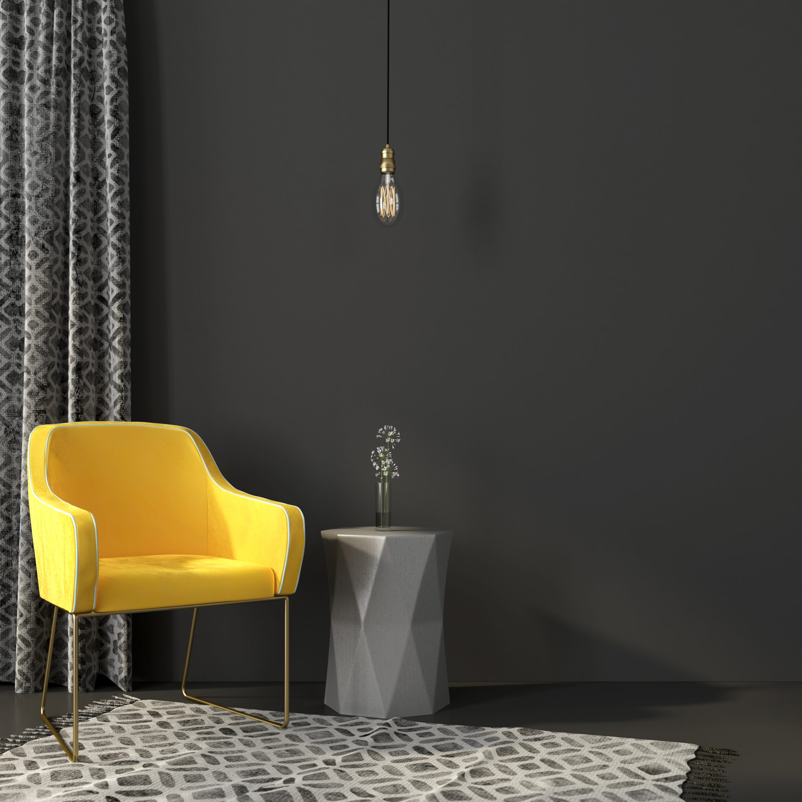
Yellow, white and black
This is a popular look at the moment and gives a monochromatic scheme something a little bit extra with a pop of colour. It’s often best to pair this look with a deeper shade of grey, such as the Ravendale Graphite Tumbled, which can be laid as flooring, allowing you to use the rest of the colour palette in soft furnishings, walls and furniture.
Varying shades of blue
Blue is a calming colour that can be perfect for rooms such as the bathroom where you want to be able to relax. By matching up varying shades of blue with slate floor tiles, you can create a tranquil look. The Ashdale Grey Riven is a perfect tile for this colour scheme as it contains hints of blue/green, tying it perfectly with your design.
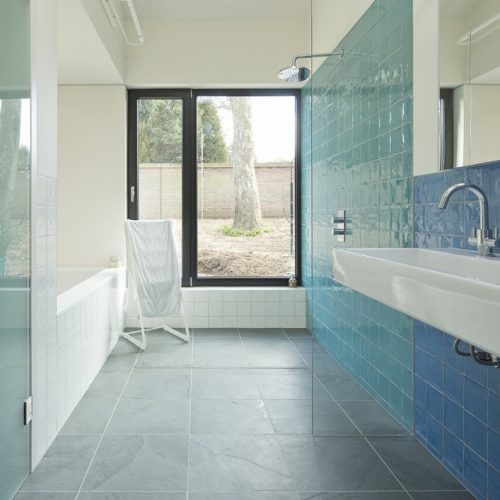
Image from our case study of Peacock House, Aldeburgh
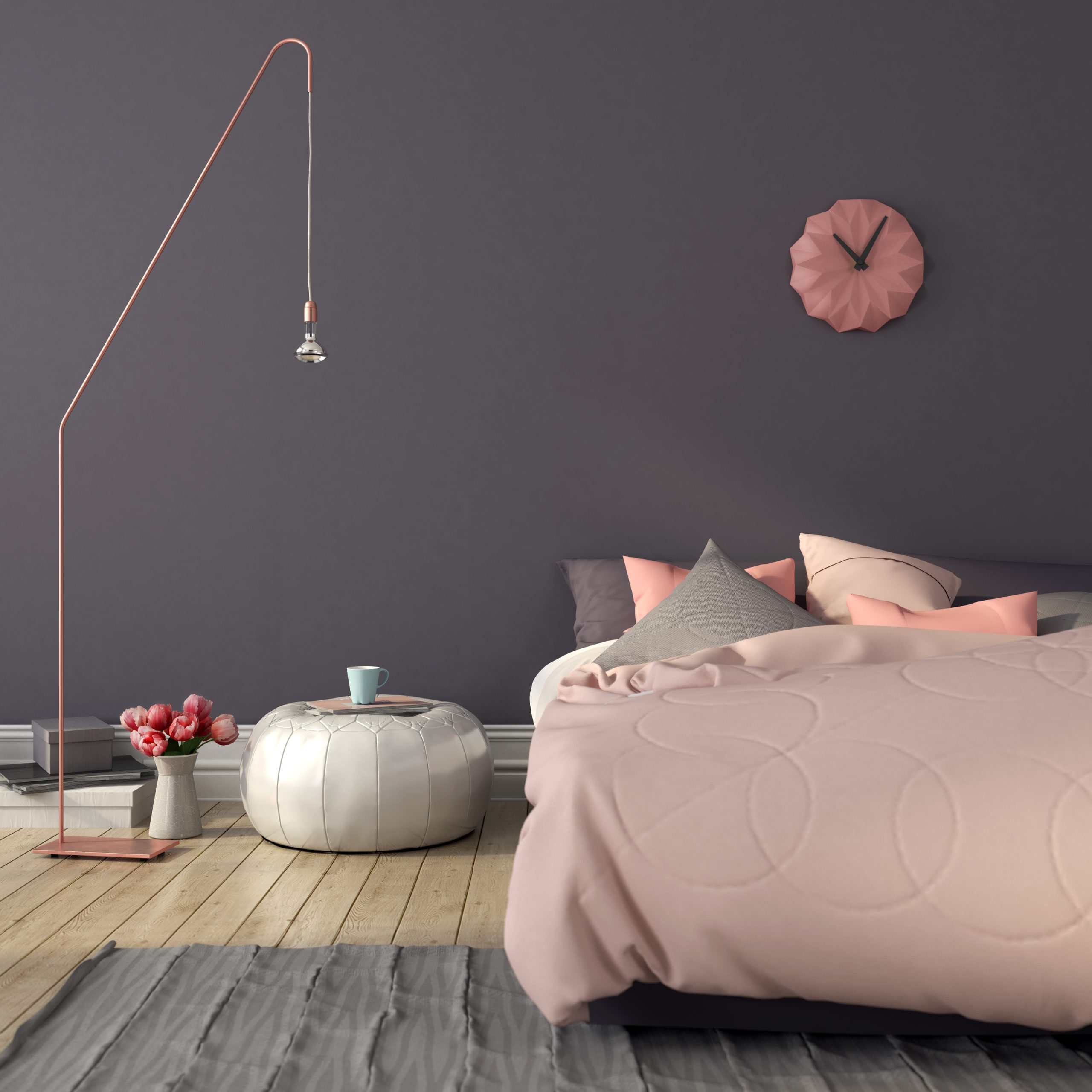
Soft Roses
White, pinks and peaches
You can achieve a soft and feminine look by matching lighter greys with soft pink and peach tones. This is a perfect look for the bedroom as it allows for a simple aesthetic that is still very pretty. You may choose not to use slate flooring in the bedroom, but a bespoke slate hearth could be perfect to give the room a touch of warmth.
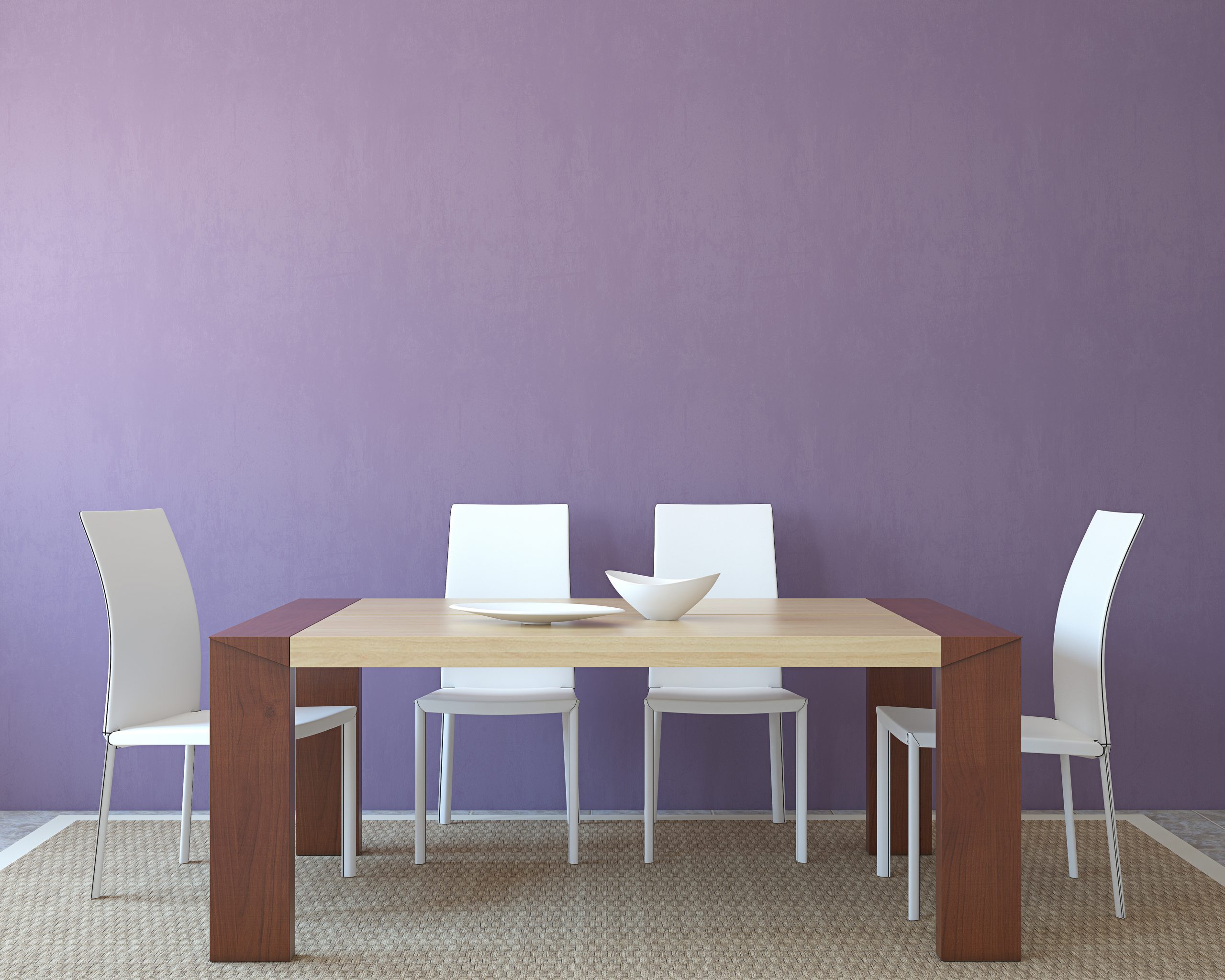
Plum, maroon and brown
There is something rather regal about this colour scheme, and you could even add a little gold to really create a royal look! This would be a fantastic look for a dining room, using slate placemats and matching with a natural wood table. Add some soft furnishings which feature colours such as plum, maroon and wine red, and you have a beautiful look.
Reds, yellows, purples or any colour you can think of!
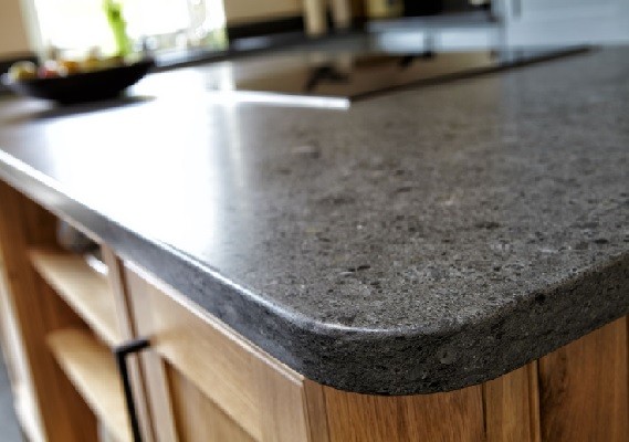
While grey can be perfect for monochromatic colour schemes, it can also work with bright colours, and it looks fantastic! This is a great look for a kitchen where you can use natural slate worksurfaces and take advantage of the innate colours of fruit and vegetables, using the reds of apples, the greens of limes and even the purples of aubergines!